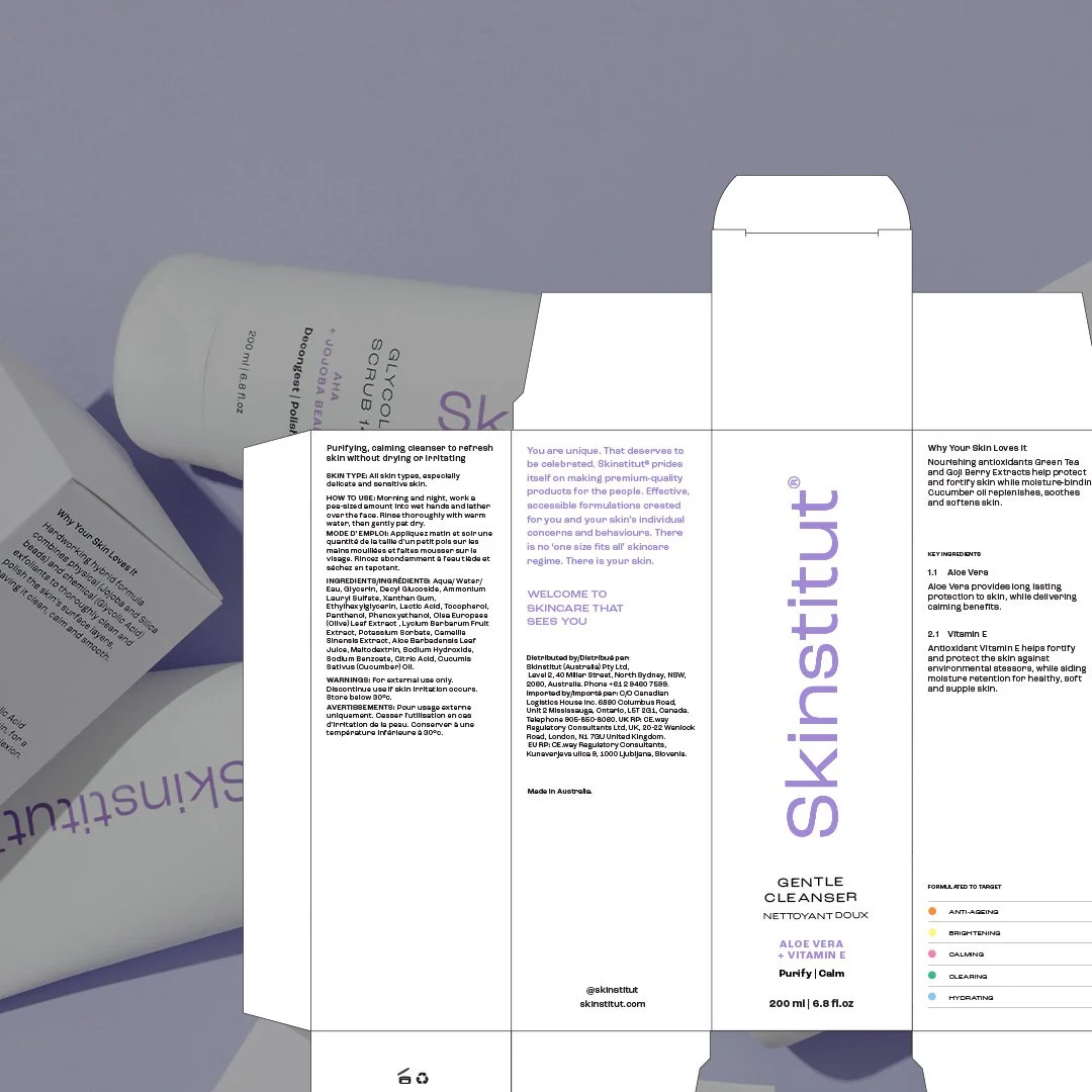
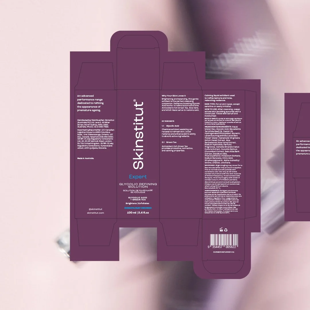
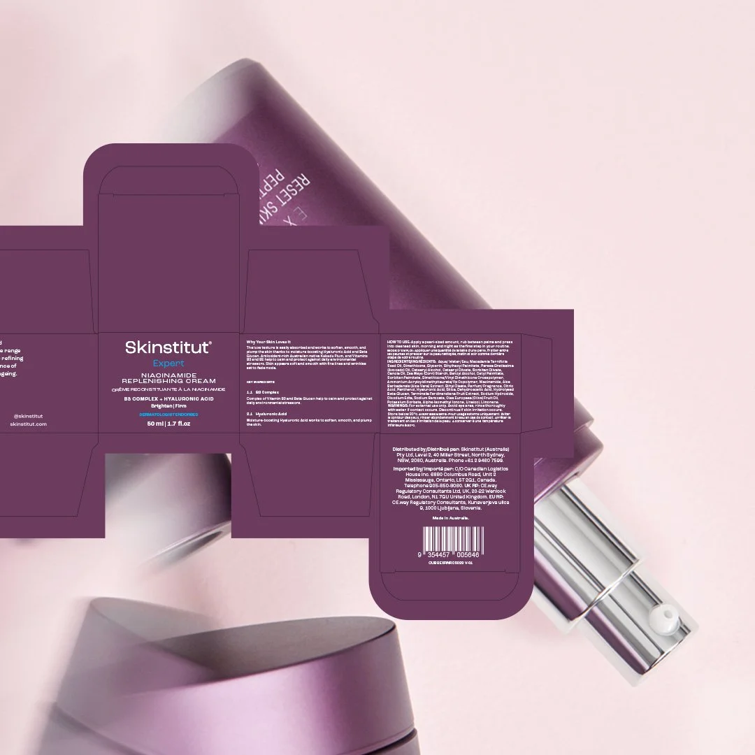
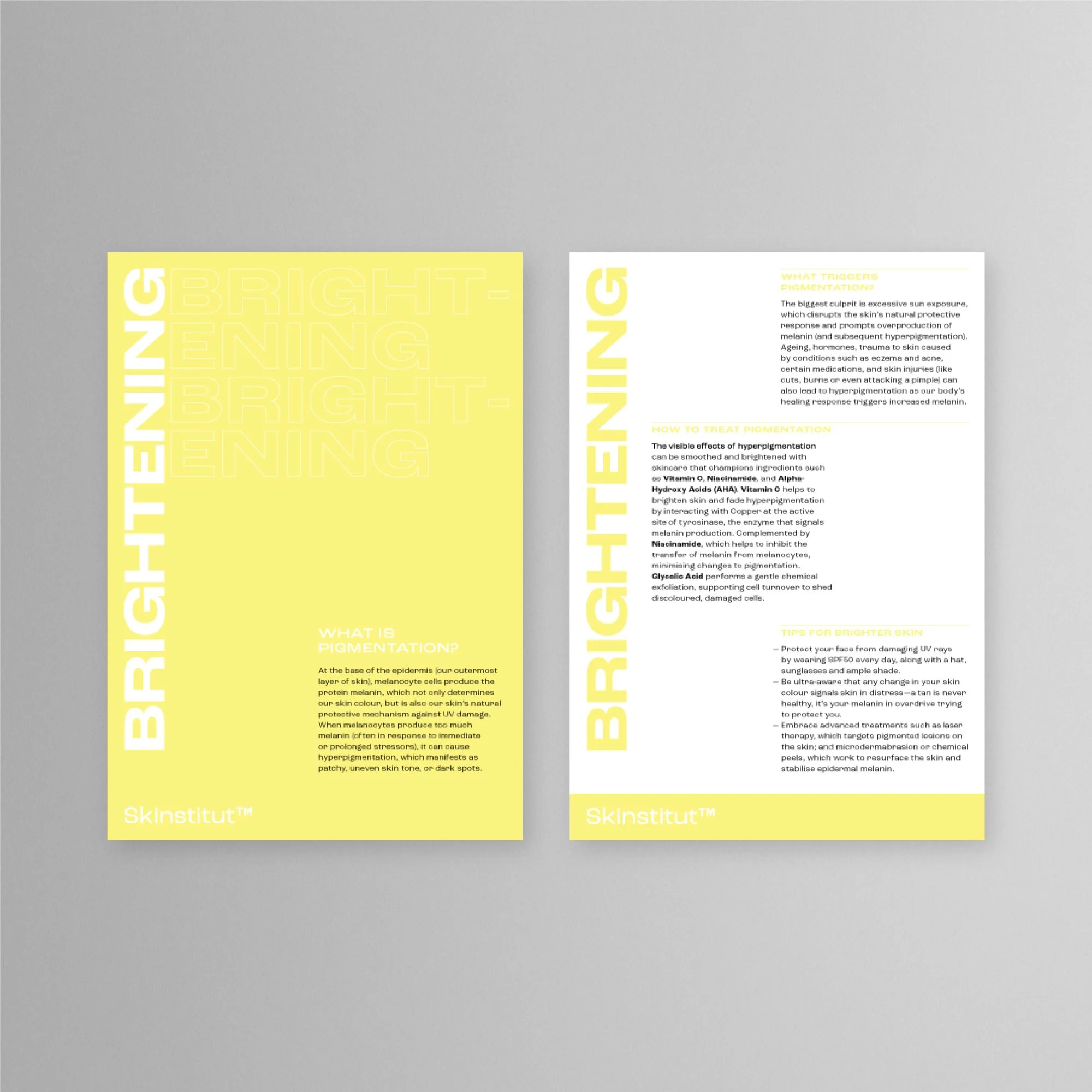
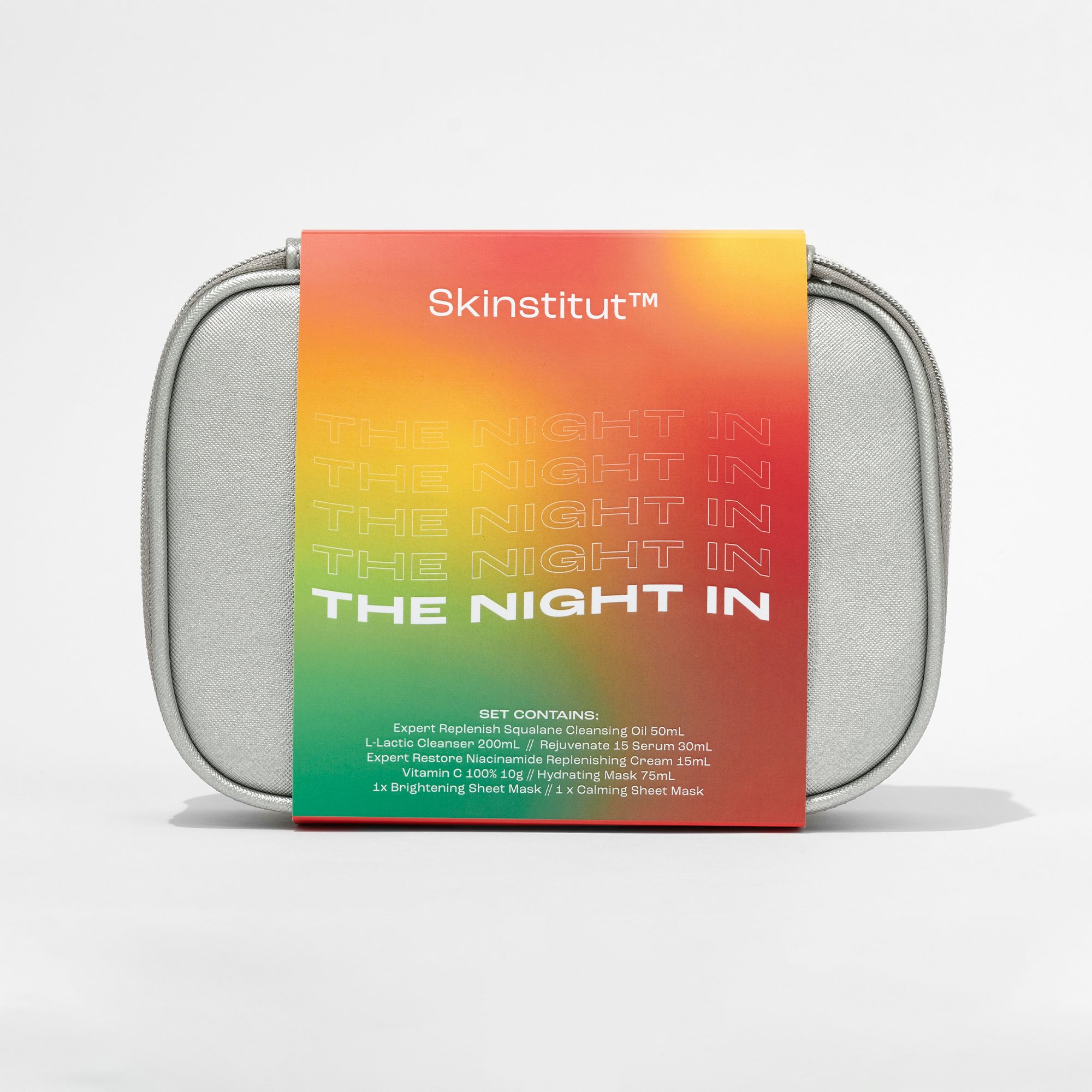
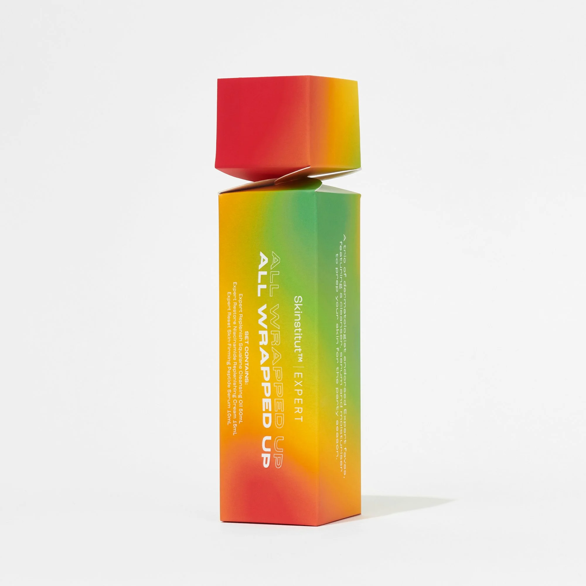
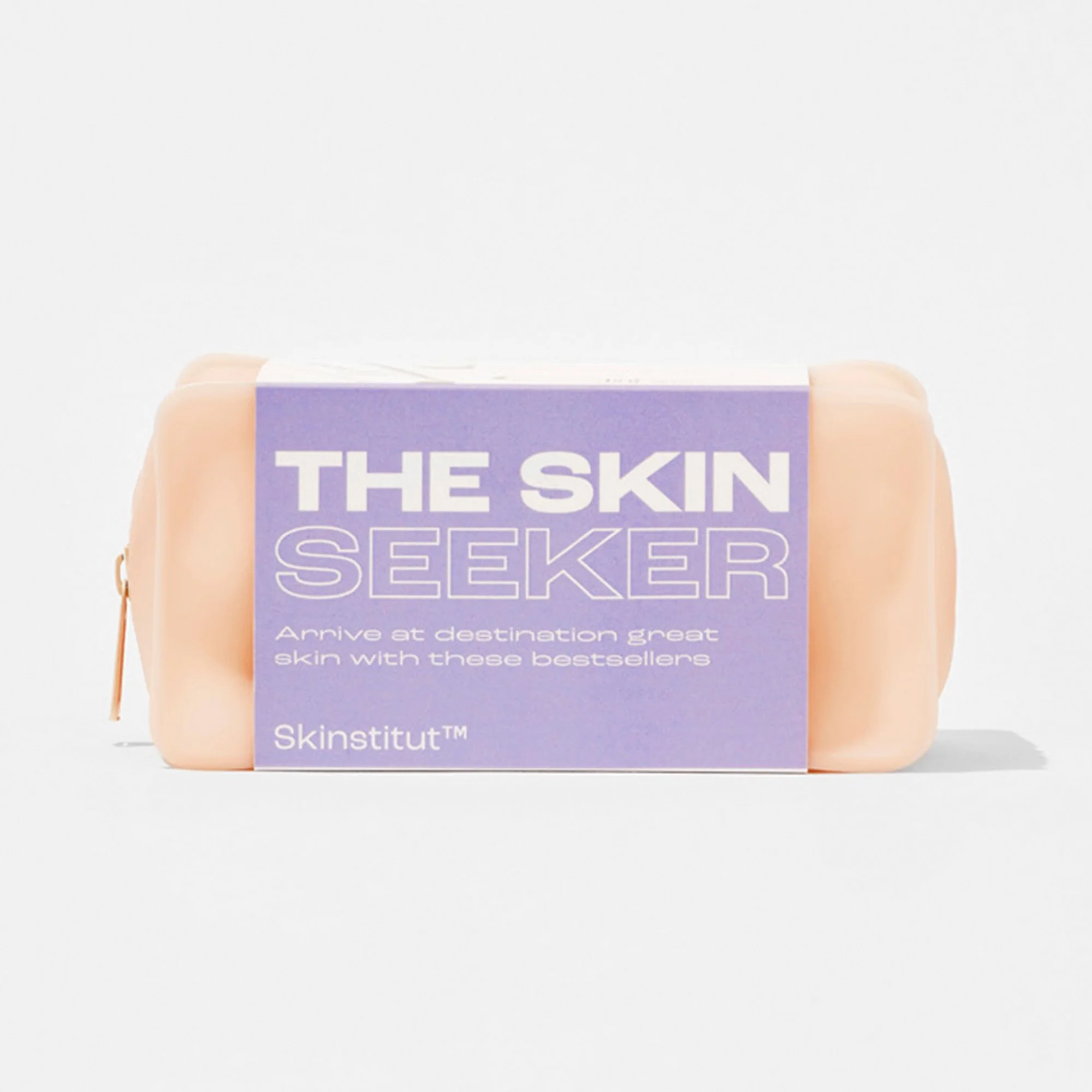
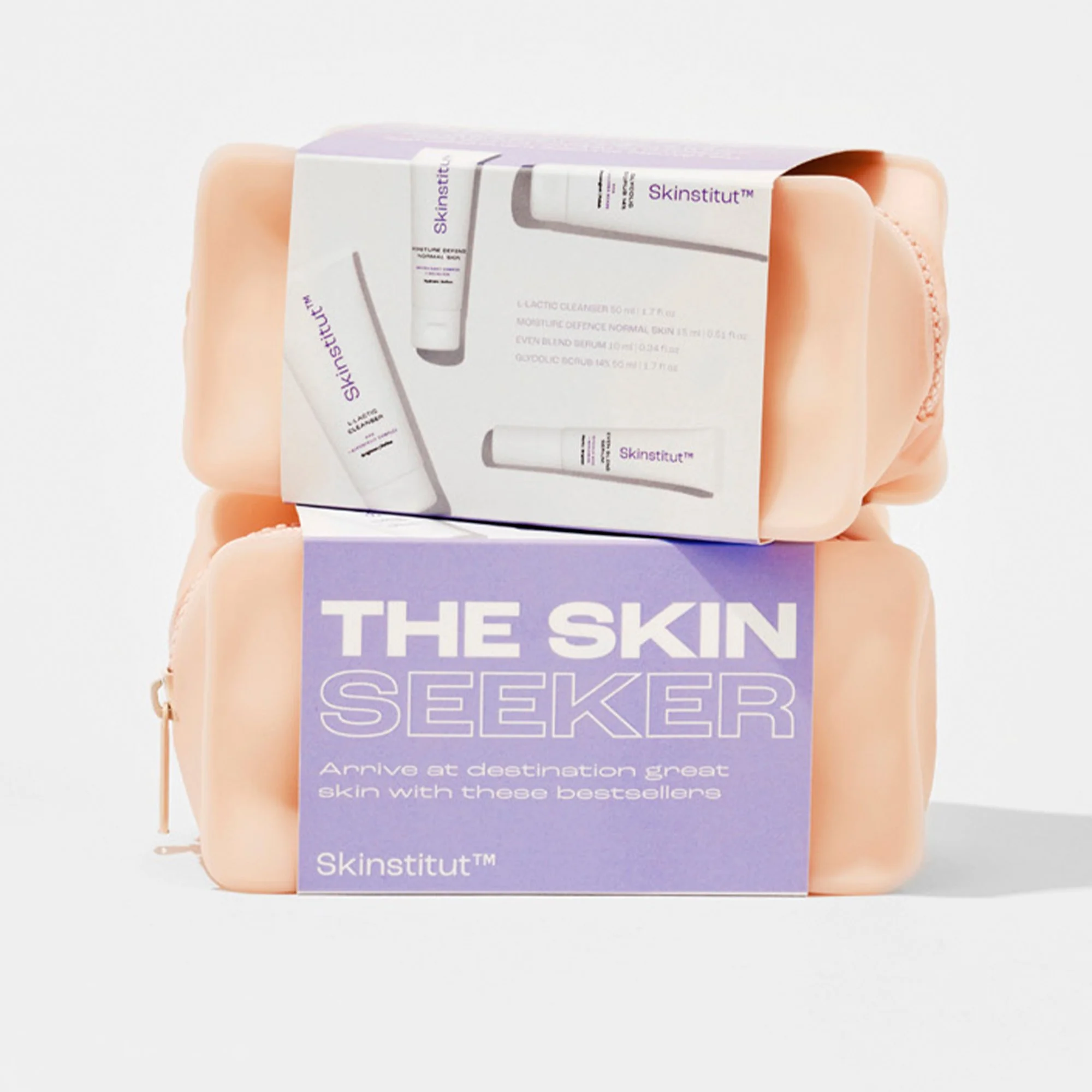


Skinstitut Rebrand
Founded in 2008, Skinstitut wanted fresh, minimal branding that emphasises its science-based roots and clinically proven ingredients and formulas.
Inspired by the molecular structure of the skin and the science behind cosmeceutical skincare, the visual direction used a 'less is more' approach. Clean, clear aesthetics are energised by visuals of fun, ‘real’ faces that demonstrate inclusivity and diversity. Crisp, simple, pharmaceutical-inspired design is combined with close-up photography of natural, glowing skin – injecting life into the brand and creating a fun, energetic brand image and desirable, trusted products.


New Packaging
Skinstitut’s old packaging was dated and no longer reflected the brand's revised mission – to empower people to make better choices for their skin. The design challenge was to take an existing range that held trust and recognition with consumers and refresh it entirely to reflect the brand’s refocused mission and appeal to today’s consumers.
I took the old packaging dielines and created new brand packaging. I also developed guidelines for consistency across a range of different types of SKUs, from 10mL to 200mL sizes. The result is a fresh, clean aesthetic across Skinstitut’s product offering that captures the updated brand mission and new youthful ethos.
Subsequent client research showed 84% of people would be 'more inclined to purchase' based on the new packaging.


Previous Packaging


Point of Sale & In-Clinic Signage


Out Of Home & Signage


Skinstitut Rebrand OOH Launch
This out-of-home campaign was created to increase Skinstitut brand awareness and promote the launch of the new packaging.
1,800 standard posters with two creative executions were distributed across two weeks, with 700 in Sydney, 700 in Melbourne and 400 in Brisbane.
50 horizontal quad posters were distributed across two weeks, with 20 in Sydney, 20 in Melbourne and 10 in Brisbane.
Weekly reach figures for street posters are 2.65 million in Sydney, 2.45 million in Melbourne and 960,000 in Brisbane, with a total reach of six million.


Skinstitut Brand Awareness
Skinstitut had the opportunity to promote its brand in Greenwood Plaza in 2021. The aim of the creative was twofold – to highlight that Skinstitut products could be purchased at Laser Clinics Australia clinics and to promote the 'Skincentives' offers of three products for $99 and five products for $150.


Social Media


Paid Social
The following is a selection of paid social carousels created for Skinstitut from 2021 to 2023. Most of these ads were created to promote the launch of Skinstitut’s Expert range.


Organic Social
The following is a selection of organic social tiles created for the Skinstitut brand from 2021 to 2023. These are designed to grow brand awareness and promote special offers and deals available to customers.


Skincare Kit Packaging


Mother’s Day Kits
These three kits were created specifically for Mother’s Day, with 'gifts for Mum' and 'gifts for you' taglines. Each of these kits offers a different benefit (hydration, calming and brightening) so I used Skinstitut’s secondary colour palette (blue, pink and orange) to convey this.


Christmas Kits
These kits were created for Christmas 2022. ‘The Fan Favourites’ was a Mecca exclusive, and the ‘All Wrapped Up’ cracker was an Adore Beauty exclusive.
The graphic design brief was to incorporate some subtle festive elements into the packaging while ensuring they could also be sold at different times of the year. I did this by creating bright gradients using traditional Christmas colours of red, gold and green.
To keep them from looking too 'Christmas-y' I incorporated a purple shade into one of the designs and dropped the green tones entirely from another. 'The Fan Favourites' design incorporates Mecca’s hero red colour – hinting at the exclusivity of that product.
I wanted the typography to create all the visual interest. Using the Skinstitut hero font, I created 'wavy' shapes with the product titles, with the replicated outlined font slowly fading upwards. Both these techniques give the text and the packaging the appearance of movement, creating dynamic, eye-catching appeal.


The Daily Double Cleanse
This kit contained Skinstitut’s newly launched 'Expert Cleansing Oil' and their core range 'L-Lactic Cleanser'.
To emphasise the pairing of the two products, the gradient on the packaging blends Skinstitut’s hero purple shade with the burgundy-purple hero shade of their 'Expert' range. I wanted to create impact primarily using the typography, so using Skinstitut’s signature outline text I created a doubled-up text effect. The client loved this design, and it was subsequently used across all launch assets for this kit.


The Skin Seeker
A selection of mini and deluxe bestsellers in an on-trend toiletries bag, this kit was promoted as a travel-size pack once international travel resumed during the Covid-19 pandemic. Because it was a collection of bestsellers, I wanted the packaging to reflect the classic Skinstitut branding. This ensures that new customers who buy the pack will recognise the Skinstitut brand colours and typography for future purchases.


Power Serums NPD Launch
These three new serums were the first products launched under Skinstitut’s refreshed brand and packaging. Formulated to deliver anti-ageing, hydrating and brightening benefits, the creative needed to reflect this targeted approach and make it easy for customers to identify which serum is which.
Using talent imagery and Skinstitut’s skin concern colour labelling system, each of the three serums is identified by their hero colour – orange, blue or green – and a specific model. This helps customers easily distinguish between the three serums and recognise their key benefits.


Packaging
These ultra-premium serums were the first products to go to market after the full Skinstitut rebrand. Their packaging design was crucial to the rollout of the rest of the new packaging.


Point Of Sale
A5 counter cards were displayed at Laser Clinics Australia clinics across the country.


Launch eDM
Open Rate: 34.9%
Click Rate: 1.7%
Placed Order Rate: 0.1%
Total Sales: $3990
Social Media
I created a carousel of images for Skinstitut’s social media platforms, incorporating each serum’s fun corresponding still-life photography.

Website Banners
Four website banners featured on the Skinstitut homepage carousel to promote the serums. Each product banner features the serum’s hero colours and hero model to clearly emphasise the distinct benefits of each serum.


Landing Page
I designed the landing page with two distinct parts. The first half is in Skinstitut’s hero purple colour – reminding the reader of Skinstitut’s authority and grounding the email in familiarity. The second half offers distinct pops of colour for each of the serums, intended to create a sense of excitement and desirability.